 Ok, if you have a weak stomach, you might want to look away at this point. (LOL) This was my kitchen before renovation...dark and dreary. You can't see it in this photo, but the genuine builder-grade, formica counter top was melted in two spots where a previous owner had apparently placed a hot pan. The back splash was the same bland, beige formica. Over the years, I had replaced the dish washer and stove. I'm not a huge fan of stainless appliances and I knew I wanted a white kitchen some day, so I chose white appliances along the way.
Ahhhh...much better! :-)

I added Kohler under cabinet lighting that can all be turned on with the flip of a single switch. I almost never use the overhead canned lighting I had installed; the soft glow of the under cabinet lighting is so much nicer.

Got rid of the bulky t.v. and replaced it with a sleeker model. Cooking isn't my favorite thing in the world, so I love having a distraction in the kitchen to help pass the time.

Decided to go with neutral colors in the kitchen...the granite I chose is called Portofino...

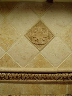
Got rid of the beige formica back splash...yeah!!! One of the more expensive parts of the renovation was this narrow trim piece and the accent tile pieces you see throughout the back splash.

Wish I had taken a picture of the original stove before it was removed...it was awful. I always wanted a double oven but my kitchen is fairly small. I found this Maytag double oven that fits in the space of a normal one. The top oven is as wide as a full size oven and is perfect for casseroles, pizza, bread/rolls and about 90% of the things you might cook in an oven on a day to day basis. It has a toaster function which is awesome for making toast or heating up leftovers. It also heats up very, very fast because of it's size...so much better than waiting for a full size oven to pre-heat.
The lower oven is full size and will hold anything a full size oven will hold. The double ovens are really handy when you have a turkey in the bottom and a casserole or bread baking in the top. So if you have limited space, but would really like a double oven, I highly recommend this one.

Since my kitchen isn't very large, I wanted to open it up as much as possible. I've always liked cabinets with glass doors so I took all the doors to a local carpenter and he cut the center panel out of each door so I could install the glass...it really opened the kitchen up.

My sister, Glenda, cross stitched this for me years ago...she knows me all too well! LOL

Oink!

Since my kitchen isn't very large, I wanted to give it some special touches. I paid a little extra and had the edge of the granite cut with an ogee edge, as opposed to the standard bull nose or squared off edge you usually see in most kitchens.

Decided to go with red accents...

This may be my favorite thing in my new kitchen...a dish washing detergent dispenser. This appealed to my practical and aesthetic side...no more unsightly detergent bottle sitting out on the counter. :-)

Before I had a dull, stainless sink. I just love my shiny white Kohler sink. :-) And as Shelia (Note Songs) would say...can you love a sink? Yes, I think you can! :-) One side is nice and deep for really large pans.

I carried the granite over to the desk area in the kitchen.

I had the granite cut large enough to create an eat in bar area for the kitchen. Whenever I entertain, guest seemed to love sitting here. I purchased a "counter depth" KitchenAid refrigerator. Counter depth refrigerators are several inches taller than normal refrigerators and about 4-5 inches less deep. It gave me several more inches of much needed space.

Standing at the sink...this is the view. The room you see through the bay and off to the right is the screened-in porch.

A shot looking across the breakfast room and out onto the porch...

Hope you enjoyed this modest little kitchen renovation.
Tuesday is Tablescape Tuesday! If you would like to participate, just leave a comment here or e-mail me at betweennapsontheporch@gmail.com. You can click on the pink TT logo in my sidebar for the details.
No comments:
Post a Comment