This pic below wasn't in the original "Before and After" post; I recently took it from an old VHS tape we made when we were just walking through this house many years ago and were thinking of making an offer. As you can see, the walls were kind of an off-white and the trim was a dark mustard gold color. The carpet (not visible in this pic) was burnt orange. The chandelier was a basic builder grade fixture...you'll see the chandelier with which I replaced it, in the upcoming pics. So, the pic below is really a Before pic...as in 18 years before!

Quite a while back, I decided I was tired of my dining room being painted all red above and below the chair rail. The room isn't overly large, so all that red made the room feel even smaller. This is the only pic I have that shows it prior to this little renovation. The decorations were for a birthday party I was giving the following day for a friend. I think this light fixture is a definite improvement over the old one.

Once I made the decision to paint beneath the chair rail, I decided to have picture molding installed, also. This pic was taken right after installation. Are you just loving the two-tone action here? What's say we leave it just like this?

Ok, maybe not. This was pretty painful to look at every day until I finally got a few days off from work and could start caulking all this new molding. (The red is actually a deeper red and not as bright as this picture indicates.)

Once I finally got the caulking done, it was time to prime over the Benjamin Moore "Raspberry Truffle" I'd just painted this room with a year ago. I know, I'm fickle. But sometimes you just have to try it one way, to know you don't like it that way. Right?

I have to admit, I was getting pretty excited by this point...definitely liking the change. I was also a bit horrified that the primer wasn't covering any better than it was....UGH. I foresaw another coat of primer before I could even start with the white paint.

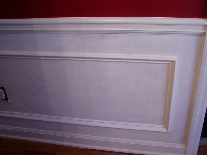
Another coat of primer...looking better...


Finally...getting to put the good stuff on...the white paint. Not sure if this pic was after the first or second coat of white paint. Still didn't have the outlet covers back in place yet.

The sideboard is still pulled out from the wall in this pic. Note the high-tech furniture moving equipment...dish towels under each leg. Hey, it works. Yep...definitely liking the white below the chair rail.

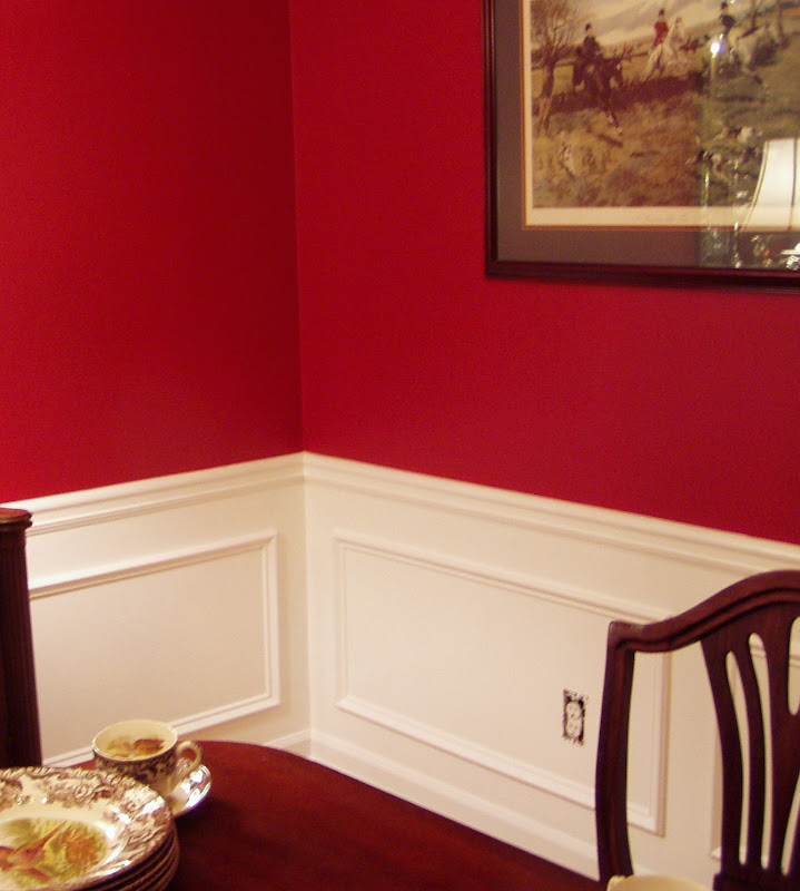
Ignore the table...how's the wall look?

I can't imagine this tablescape with an all red wall behind it. I think the additional molding and white paint were a good change...but what do you think? Was it worth all the work?

Hope you enjoyed this re-post of the post that spawned Metamorphosis Mondays. :-) Have a wonderful Memorial Day!

If you are participating in Metamorphosis Monday, please be sure to add your permalink below, and not your general blog address. If you aren't sure how to obtain your permalink or have any questions about using Mr. Linky for this post, just click HERE for detailed instructions.
Don't forget to copy and paste the Met Monday logo button to your computer so you can add it to your side bar and your Met Monday post. That way visitors will know that your are participating in Metamorphosis Monday.
Please be sure to link back to the host blog, Between Naps on the Porch, so your fellow bloggers who are participating today, will get lots of visits, as well.
Please do not add your link below until your Met Monday post is actually published to your blog.
No comments:
Post a Comment