Showing posts with label graphic design. Show all posts

Saturday, 23 July 2011

A Few Layout Tweaks...


I grew bored of the LCH layout not long after I installed it in December, but each time I go to design something new I find it impossible to leave behind the original colors of my personal branding. Instead, I opted to make a few minor changes. New background, header, a super fun navigation bar (hover over them!), etc. I'll roll out the rest of the tweaks in the next few days but I wanted to get this up while I was on a roll (mainly so I couldn't back out of it!). I think as a designer you tend to be your own worst critic.

If you're reading in BlogLovin' or Google Reader, click over (HERE!) to check out the new subtle look yourself! 

I'm wiped out now! Last night was a long night of work and I'm gearing up for another! xo

Wednesday, 20 July 2011

Operation Honeybean! Hand-drawn Typography...


Hello honeybees! So in light of my recent career announcement, I had many people offer up the idea of starting a KickStarter fund for people to help support my self-employed dreams. While I truly appreciate all of your sweet gestures, words, and encouragement at my hesitation, I simply do not feel comfortable doing such a thing. While I fully understand the reason KickStarter (and various other funding websites) exist, I don't feel comfortable accepting money when my endeavor is one that will (hopefully!) generate me profit. If the circumstances were different, perhaps I wouldn't be so quick to write it off. Even when I said I didn't really like the idea, so many of you jumped in and said that it would be wonderful and you'd love to support my endeavor, and that means the world to me! But rather than just giving me your money, how about I earn it? 

I mentioned in my post that 100% of the profits from Hive + Honey, Kaelah's Closet, and at least 50% from sponsoring Little Chief Honeybee would go to fund my little dream... well, since I'm going at it alone, I need to get creative in other ways to help fund it. So here I am! Presenting you with my newest creation! Hand-drawn typography!

(this typeface is not one of them sadly! :P)

I loved making my own typefaces in college and I really really love scribbling them down in my Little Book of Ideas. I formatted them out as a typeface for myself and thought, why not offer them to you, too?! You're obviously design savvy people! I've spent oh so many hours drawing up some typefaces and I will be releasing one at a time. The process is simple... you just purchase the typeface via PayPal and it will be emailed to you within 24 hours. You just download the file and install the font! Then you're free to use it on Word, Photoshop, Illustrator, etc! You can change the size, color, opacity... you name it! And of course, 100% of the proceeds will go directly into the mobile boutique fund! 

I had a lot of fun making them and I'll continue to work toward new ones daily! If you have an idea of something you'd like to see, let me know! I'm even working on a few sets of "Webding" type symbols! Cutesy stuff! 

Up for grabs first is a typeface I first started my sophomore year of college! I drew it for my Loquat album-redesign and it's been my "go to" style for doodling ever since! Feel free to purchase below!


Sketchbook 2011


PS; I can also make you a custom signature (like mine!) using your handwriting, mine, or a typeface for just $5! Email me at kaelahbee@gmail.com if you're interested! 

Friday, 13 May 2011

Introducing... hive + honey

It's been in the works for quite a while now, that's for sure! But I'm happy to finally unveil my newest shoppe endeavor, hive + honey. hive + honey will be an exciting handmade adventure for me and it will focus around the handcrafted fascinators you've seen on the blog recently, as well as some other projects and collections which will launch at a later date. It was so important to me to brand the shoppe in a way that was cohesive and implied, not only through my personal branding, but also that of this little blog. That's why I'm working on a possible redesign for Little Chief Honeybee as well! I've loved the coral pink and blue for a while now, but even if I decide to keep the colors, I'll be updating various bits of the overall design to be more matchy-matchy.


The shoppe will be launching within the remainder of the month, and you'll be able to snag up one of the fifty-or-so pre-made fascinators that I've been laboring away at. All of my promotional materials have not arrived so they will be added to orders once they are delivered.

Why a new shop? you might ask. Well, it's simple. You know by now that my two little gals, Pipkin and Georgia, are very near and dear to my heart. They are my pride and joy and I treat them just like they were my children. (I mean, c'mon... they both have health insurance, and I don't!). Their health and well-being is top priority in my book. Pipkin is laying in my lap this very second with a stitched up tummy and a bloody nose. She had two surgeries this morning (a routine spay and she had her nostrils clipped). Her pinched nose was causing her a lot of breathing difficulties. Georgia, my sweet little baked potato, is having two eye surgeries on Thursday. These will be her fifth and sixth! You can imagine the financial damage that does on one's wallet, yes? I've decided to use this as motivation to get my shoppe back up and running again under a new name and new direction.

Capitalizing on the "Bee" aspect of my name, I'm continuing to brand the under the umbrella of Kaelah Bee and Little Chief Honeybee. There will be lots of exciting things rolling out in the next few days/weeks/months and I hope that you'll all be a part of it! xo

PS; Feel free to weigh-in with your thoughts in the comments below!

Monday, 28 February 2011

Life's Too Short for the Wrong Job

I remember seeing this brilliant ad campaign a few years ago, but I only recently stumbled upon a full collection of pictures. This is hands down one of the most well planned and executed campaigns that I've ever seen. While the Sherwin Williams paint-swatch campaign will always have a place in my heart, I'm tempted to say few things have beat this one out. The campaign is for the German job site, Jobsintown.de. If I'm not mistaken these ads go all the way back to early 2006, or even before! The point of the ads is pretty transparent, but that's what makes the impact so powerful. I am in awe. Brilliant use of design!


They're even borderline creepy! It's as though you just expect them to start moving!

What are your thoughts? What are some of your favorite or most memorable ad campaigns?

Monday, 10 January 2011

A Few Designs...

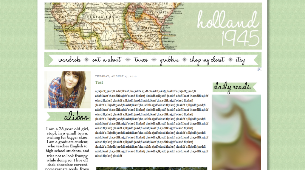
I'm not sure what has snapped into me, but I think the chill of our little "blizzard" and the late night really got me pumping to design some blogs. A gal emailed me a while back about updating her blogger design but so much has been in my way. From finals, to graduation, to art show, school, lots of sickness, and now my Illustrator going defunct, it was easy to see why I was so discouraged by design. Normally I work about 75% of my redesigns from Adobe Illustrator (I just really love that program!) but this gal was so sweet and I really wanted to help her out because I had a vision for it. With that being said, I put on my big girl britches and got to work using 100% Photoshop. Now, it's not like that's weird or anything.. but it's not my method. I like having my methods. Anyhow, I quickly fell in love with the design and even though I hadn't run anything by her yet, I started coding. I started doing all the little nooks and crannies and just designing my heart out... I figured if she didn't love it then I'd finish the design and hold on to it until someone did! (Or even myself!). Luckily she was enthralled at the look! It's not 100%  completed yet and it's not implemented on her site... it's on my layout tester blog, but still, I wanted to share! I'll share a link and everything once it's up and ready! For now you just get a screenshot.... I love the map detail! Makes me want to travel!

click to view larger


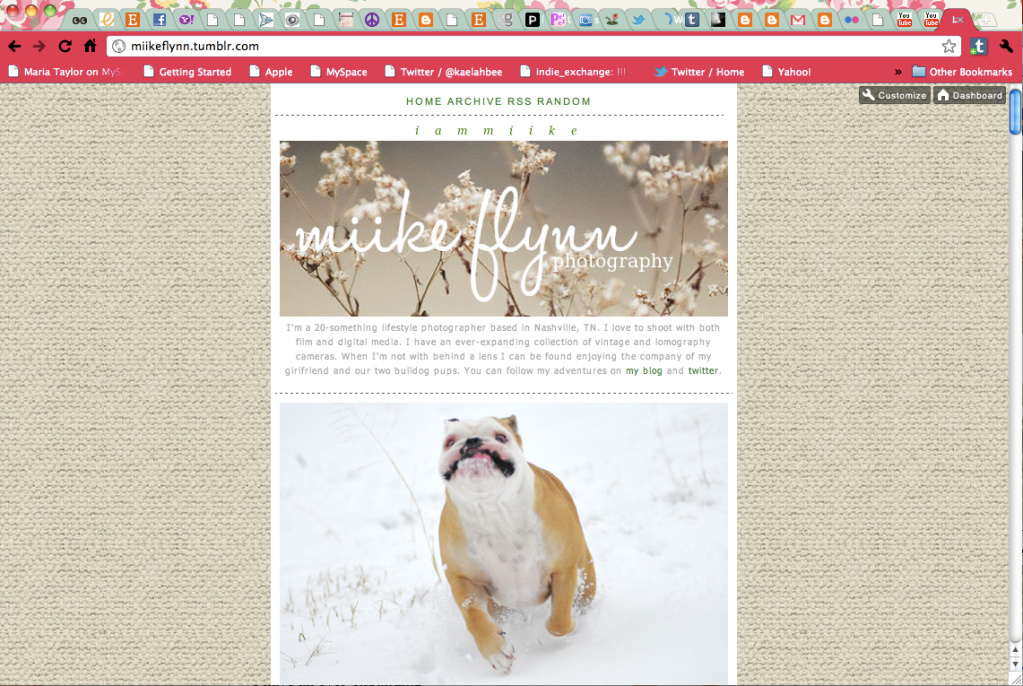
By the time I was wrapping this one up it was almost midnight. Mike needed a redesign on his blog, too, so  I decided to burn that midnight oil and power through his as well! It definitely wasn't the plan, but the snow started to pile up and he was content watching tv so I did it! It's just serving as a temporary branding and probably won't be his final look (especially the logo... I just haven't thrown myself into that yet!) but we wanted to play up the burlap look because we're loving all things burlap lately! After a trip to Anthropologie not long ago, we were bursting at the seams with ideas for our little shop and all these burlap displays! We loved it so much we went to Hobby Lobby and bought several yards of it for crafts! I love the rustic feel of it. I chose to use the header photo from our trip out to take outfit photos last week. We both love the soft whimsical look of it, and I think it serves his blog well. I also redid his Tumblr, too! It's much more quaint and simple, but still, it fits his branding thus far.


click to view larger

click to view larger

With that being said, I'm officially re-open for blog commissions! I'm able to throw myself into them and have them done in a matter of hours/days. I really love when I get excited about it! I haven't taken a blog commission in several months! If you've emailed me about them and I've just sort of left you hanging, I'm so sorry! This past semester was not a good one for projects aside from finals! If you want buttons, a header, a background, or a complete coded redesign, feel free to email me at kaelahbee@gmail.com! Hooray!

Sunday, 9 January 2011

Sunday Spotlight - Graphic Designer: Croak & Hum

I really love when I stumble upon a fellow designer that makes me feel passion for my degree once more. I think we can all safely say that my love is strong, but my passion to do it full time is ever wavering. I know, however, that I did not go to college for 4+ years to get a pointless degree. In fact it is sure to help me in every aspect of my life because we are constantly surrounded by design. But still I am taken by Kate Harmer's ability to bring simplicity, a tactful use of color, and strategy into her designs. They're truly remarkable! I think my favorite part about Kate's work through her design name Croak and Hum is the way she employs texture throughout her designs. It's never overbearing.. just subtle and the exact amount to make it "just right". If there is one thing I could learn from her (let's be honest, there are tons!), it would be how to manage this very effect! Nevertheless, here are some photos. Hopefully you'll enjoy them, too! (Psst.. there are a few that are sure to surprise you! I know you've seen them around... now you'll know the graphic genius behind them! How exciting!)


It's so inspiring to see someone who just "gets it"... I love following Kate's work via twitter, tumblr, flickr and her website. She even has a shop where you can sport some of her work on your iPhone! And yes, I have thoroughly considered it. Be sure to stop by the links above and admire her work, and maybe even say hello!

Monday, 22 November 2010

Working Hard or Hardly Working?

It's down to the wire. I have one paper left to turn in and one "exam" to take (both next Thursday) and that's it! I have a senior presentation review next Wednesday (in front of a bunch of faculty, professors, professionals, etc) and I'm a bit nervous (doesn't help that I volunteered myself to go first so I could make it to my tattoo appointment), and then next Thursday night is our senior art show! I'm excited about it, but also ready to just get it over with. I'll hopefully be seeing some family that I haven't seen in far too long and that will be nice. (Hopefully). 


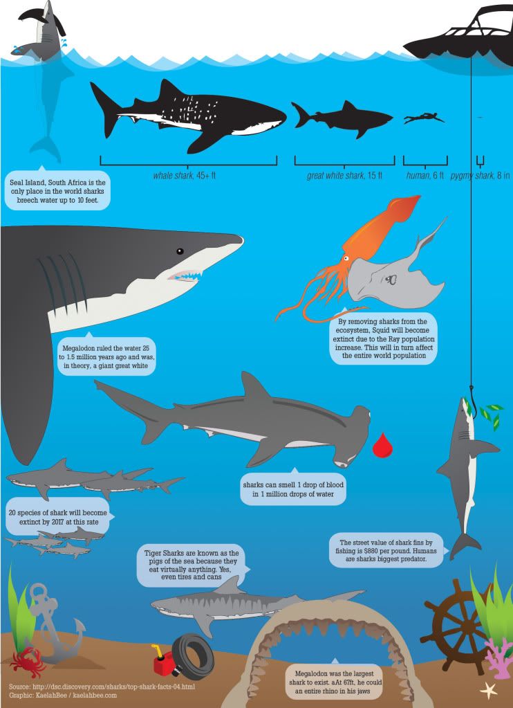
But I'm always being asked to show some more of my work so I figured I'd post what I've spent the entire morning working on. It's a shark illustrated infographic. The concept is for it to be in biology classrooms and the bedrooms of kids who are fascinated by sharks like I am. It's also an aim at shark conservation. I'm tickled to have a 100% shark piece in my portfolio.

You can see a few more of my pieces by visiting our senior website here: OmoreSelect.com (yea, there's only 4 of us graduating!). I'll share larger images of those pieces later once I start printing them for my portfolio. You'll also notice that 99% of my stuff is vector-based illustrations. What can I say? I love to illustrate. I do wish I had more photographic pieces but oh well! 

(click to view larger)

I'll be back with my Monday mixtape shortly! xo


ETA: I *think* I've found and fixed all of the typos and missing words, etc, but don't hesitate to comment if you find something! (I haven't updated the picture because it takes years to export, but the bottom Megalodon has been fixed and so has the random not-capitalized words! Whoops!)

Monday, 17 May 2010

Music Monday : LOQUAT


If you've ever discussed music with me, you've probably heard me rave on and on about the musical stylings of LOQUAT, an indie band based out of San Francisco. And if you've ever ridden in the car with me or had the pleasure of being in my graces around my iPod (kidding, about the graces thing) then you've probably heard some of their stuff. If not, why haven't we hung out lately?!

Anyway, I'm a huge fan, to say the least. A lot of you have followed my blog (back in the LJ days) and probably remember when Adam (the ex) and I ventured to San Fran for our 2 year anniversary for their cd release show. I did an album art redesign of It's Yours To Keep for my InDesign class in 2008 and I was able to hand it to Kylee herself at the show (*squee!*). Okay okay, I promise I'm not the squealing fan girl type... I'm really not. Everyone in the band was really cool and laid back. It was a fantastic show to say the absolute least. Well, Portfolio class rolled around this semester and without a doubt, I wanted to rehash the designs and work out some kinks. I think all of the changes made were definitely for the best and they show a much more mature design aesthetic.

All of the images, typography and illustrations are hand-drawn by me. I went on to design the entire typeface, including numbers, for my Typography II class and I titled it "Moleskine '09" (since that's where the design originated haha). The opening spread (the lyrics and illustration) are based off of a line in "Swingset Chain" which was the first song I ever heard by Loquat. The entire design is based on the whimsy of that line.

Enough about the design.. this is about music. If you CLICK HERE, you can go to their website and listen to some tracks off of their sophomore album, Secrets of The Sea. There's so much that could be said about their music. Kylee's voice has a certain sound to it... something that was jaw-dropping when I saw them live. I thought for sure it was studio-induced but I was so incredibly wrong. There's a catchy side to their music, too, but not too-poppy. I don't even know how to explain it... I guess the best remedy for this is for you to go listen to it yourself and draw your own conclusions. And then gear up for their third album which they're currently recording because I promise, you're going to be hooked!

Here's where you can find them online:

And here are the designs!

♥ (see full size photos HERE) ♥

I guess I was hoping I could kill two birds with one stone (for the lack of a better phrase) and share my favorite band and some of my designs, since I constantly get asked in my FormSpring to post them. :) Don't be too harsh!

Let me know what you think of Loquat! They're really really fantastic, I promise!

Time for me to rush off to bed. Mike is a sleepy bee!

xoxo

Tuesday, 27 April 2010

An Upfront Apology...

Here's to let you all know that this week may be kind of slow here at KaelahBee.com. It's finals week, as I've said probably countless times before (woe is me!) and while I have no actual classes left, I do have to present my Sweet Cheeks Bakery stuff tomorrow at the Frist Center for the Visual Arts, print, photograph, trim, and pack my portfolio to drop off by 1pm on Thursday, and then cram for my final Art History exam EVER on Friday morning. Not to mention throwing in a few hours of getting my leg tattooed tomorrow night... Neither convenient on the time, nor money, front... but it has to be done so it shall! I'll be making flash cards to study for art history while I get tattooed. I'm a nerd... It's cool.

I don't mean to leave y'all hanging but I'm sure you understand! I bet more than a fair share of you are experiencing the same stressed out feeling of finals just like myself. And to think, just ONE more semester! I shall be a college graduate! Oh joy!

A lot of you have said you wish I would show my design work more so here you go. A logo and menu for my vegan bakery, Sweet Cheeks.

This is the logo for Sweet Cheeks. It still needs some tweaks but I'm much to physically & mentally exhausted to even think about dealing with it now. So it shall stay. Hmph.


The menu is a folding menu with a curved photo on the inside/end. A magnet falls down from the third panel. The top row is the inside of the menu, while the bottom row is the outside of the menu. All laid flat (obviously haha). (Click the image to view it larger)


Anywhoo, It's 11:30pm, I just dragged myself from school. I'm going to put on my jammies and settle into bed. Waking up bright and early so Mike can go to work and I can prepare for both my presentation and my tattoo appointment. Maybe I can churn out these flash cards tonight. Wish me luck!

xoxo

Wednesday, 7 April 2010

Busy Bee.

I wasn't lying when I said I'd be going full throttle this week. So far, I've thrown out a book concept, come up with another one (on Monday morning), started designing it, laid out a dummy book and labeled every single page while planning, wrote the full text/copy, took photos, then took photos OF photos, laid them out, manually paginated all 168 pages, printed, trimmed, comped, hand-bound the book, padded a cover, upholstered the cover, drilled holes through the whole thing and then attached it all with bolts. I did all of that within 36 hours. How I managed to create and design 168 pages.... I'll never know. But I did. it's done. 6 hours at Kinko's and I have a 99% finished book (I say 99% because in reality, I'd have to switch out some of the photos for other ones but I didnt get them developed in time. oh film!)

I was giddy last night when I left Kinkos right before midnight. GIDDY! So giddy that I allowed myself to come home and watch 2 episodes of Dexter with Mike. Eep! Presentations are today at 1pm. I have to head over to school early though because I have a Student Government meeting. After class we're heading to Nashville to get my calf tattooed. I'm nervous as balls but hopefully all goes well.

Yesterday while trying to lay out the rest of my book and come up with copy, we took Georgia to the puppy park. She has fun and is distracted and I get to sit on the bench and be productive. She had so much fun. However, one mean dog was rolling her on the ground and biting her. G's tongue was bleeding at one point but she didn't care. She's so unphased by that stuff. She just ran and ran and ran, and then swam some and then rolled in the dirt. She LOVES the puppy park and I love to take her. I feel like a good Momma. One lady kept getting angry at her dog for getting wet/dirty... uh hello... this is a puppy park. With other puppies. That play. and get muddy. Dogs will be dogs. By the time we got G to the car, she was covered head to toe in mud. I love that little stinker.

Oh speaking of G.... She's having her eye surgery on Friday! It was scheduled with a dental clean on May 3rd but we called and had it bumped up to April 9th! SO EXCITED!

Here's some silly pictures of her yesterday while she slept on my fabric while I was trying to make my book cover.


We used a drill to drill through the book and apply the bolts. This was the dummy mockup that I did so I could make sure every single page was laid out correctly and so that when I paginated it by hand, I did so correctly. It was time consuming to make this dummy book but SO worth it in the end. It saved my butt so many times these past 2 days.


Here's some rough photos of my book. This is the cover (it's padded) and it's bound with 2 bolts. The 1 inch on the left side stays flat and the rest of the book is scored to bend and open easily.


This is an interior spread. Each "day" has an assignment, paired with a photo (this one doesn't relate), and then the next spread is a page for you to journal about what you did, and then a page for you to attach a photo that you took to represent that day. (The kit also comes with photo corners that are black so that you can put any size photo in there, be it a polaroid or 4x6 etc)


Apparently Mello Yello did a redesign?! IDK but I love it. I hate mello yello but I bought it just because of the packaging. Yes, I'm a packaging nerd.


xo


PS: I've been asked a few times what my calf tattoos were going to be and I'm not sure I ever mentioned so here you go... the one I'm getting today is on my right calf and it's a traditional piece with roses, swallow, a banner that reads "Nana" and a vintage sewing machine/spool of thread/needle because my Nana was a seamstress all her life. The one on my left calf (to come later) is the same idea, but with the masonic symbol and stonemason tools because my Papa was a stonemason :) so there you have it :) *(I just told my artist what I was thinking... I said "traditional pieces, flowers and a vintage sewing machine with the words in a banner saying Nana" and she came up with a really great sketch that I went to see yesterday. Oddly enough, it's very reminiscent of the adorable Silje's calf tattoos, but don't worry, I didn't copy her or steal her design or anything. But if you haven't read her blog, go check it out HERE. She did a wonderful watercolor painting of Bert for me! She's adorable!)*

PPS: To clear up any confusion with the last photo post... NO, Mike and I are NOT engaged! haha! I realize I'm sporting a big rock on that left ring finger but I can assure you that it's a $12.99 Target special! I wear it while I'm at work/the bar so when drunk fellas come calling, I can flash it and say "I'm taken". It really really gets old in the bar. Mike and I both hope that one day that time will come for us, and I will be very excited for it so I'll probably blog immediately :P As much as I'd love to get engaged right now, I feel like an engagement puts pressure on you to start planning the wedding immediately (and even though I've been planning it my whole life, I don't want to rush to the altar just yet!) Rest assured, I will let you know if and when!

Wednesday, 27 January 2010

new look around here!

hey y'all! exciting fun times to be had! i'm still a wee bit under the weather, and i skipped out on Print 2 today to be alerted of my awesome "~Sinus Infection"... ladeedahh! but luckily i'm already feeling a bit better so hopefully i'll continue to be on the upswing of things!

i didnt take a lot of time to blog today because between the almost-fever, the feeling like i'm going to die, and the headaches, i've just wanted to rest. but i managed to work on my Print 2 book for 6 hours and take a hot hot bath [Georgia jumped in, too].

i took a little time to work on new blog buttons [3 new designs on the right side!] and a new blog header! please take a minute to change out the blog button if you'd like. i realize they're a little more visually interesting than the horrible hack job i did in flash for the GIF one. i promise to have a new and improve GIF animated banner up shortly!

so yes! please choose one of your liking and let me know how you feel about the new blog banner! i'm going to be doing a whole new CSS layout over the next few weeks and finally phase out what i've got now. i need 2 side panels so it's time to get a crackin!

hope your'e having a great week! we went & stocked up on food as per my mother's request since we're supposed to get "snow and ice" this weekend. bleh, hope i can still make it to work!

xoxoxox

Thursday, 5 November 2009

banner!

yay! i finally got my banner to export! (though the colors were altered slightly. ew at the bubble colors!) haha i dont really want to spend too much time fixing it in the moment but if anyone wants to help support kaelahbee.com, it'd be so so so amazing if you could post this on your website or blog or profile!

if you want something in return, i'd be happy to promote your page as well!


if you'd like to put this on your page, please copy the html below and paste where you see fit!


happy blogging! thanks so much guys! you're all so amazing!

xo

ps; i'm working on making smaller horizontal ones as well as smaller square ones! if you're interested in one just let me know and ill do it quicker!


EDIT AGAIN! HERE'S A SMALLER VERSION! 240px by 200px!


and an even SMALLER VERSION! oh my! 200 x 166px!